Search

WintreKitty Reviews and Contests

Comic Critiques and Art Contests

Month

February 2016

Out of My Element by Alli and Jim Perry


Jillian Chevalier never really fit in with her noble peers. When a stint of wanderlust goes awry, the gears of her world begin to whirl out of control; Suddenly she finds herself befriended by a group of rebels, propositioned by the most powerful man in the city and to top it all off – the truth about her heredity is brought to light.

Now she has to keep the truth about herself hidden, satisfy her unending curiosity about the rebellion’s true purpose and rebuff the approaches of a man who could ruin her life with but a word.


Story

I believe I stumbled across Out of My Element by Alli and Jim Perry a couple years ago, but never got very far with the story. The problem wasn’t the comic, but rather the timing for me. I picked it up when I wasn’t really looking for anything new to read. This caused me to miss out on something great.

­Alli and Jim Perry planned exactly where they wanted this story to go, and it is evident that they put the time into this project. Creating a fantastic plot is only part of the hassle, though. You also need to be able to introduce your characters well in order for that plot to be able to develop. I’d say that the Perry’s do a pretty good job at this, too.

Casual conversations is a great way to introduce personality traits.

Out of My Element also offers some nice comedic relief, yet still staying on the path for a serious plot. The humour merely compliments the story buildups and helps keep it going when a standstill could have otherwise threatened the plot development.

The humour is so subtle sometimes, and so integrated into the story, that it just adds to the flow of the comic.

Overall, with a well-laid out plot and sustainable characters, the Perry’s have created a professional vibe for a very lovely comic.

Writing

As for the writing, there were some grammar errors that I caught that most people would have overlooked (sorry, I’m a grammar Nazi). Double-check and then triple-check the proper word in those tricky areas. Break out that English Grammar for Dummies book if you need to!

Grammar mistakes eat at my soul.

I’ll move on since most of you probably don’t want to hear me rant about grammar forever.

This one is actually a comic characteristic, but I felt that it was pretty noticeable in Out of My Element: one way conversations. I understand the purpose of them, it helps the reader know what the character is thinking (especially when they are alone), but I feel like there may be some areas where more show and less tell could be used to accomplish the same results.

Don’t worry. I talk to myself when I’m alone too… and sometimes in public.

However, when characters actually did share a conversation, they were really well done. In fact, there was some serious character chemistry in some scenes, so much so that it felt like a tv show more than a comic. Chemistry is hard to capture, but the Perry’s did an excellent job!

What’s that word you kids use nowadays? “Ship?”

Art

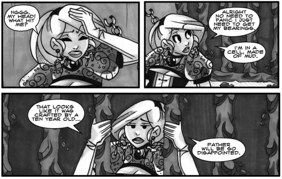
Out of My Element not only offers a greatly developed plot, but the art is also on par with the story. This comic utilizes the transfer from black and white into colour, similar to other comics I have read (and reviewed). I love this tactic of demonstrating a big plot climax by throwing colour into the mix. Although it isn’t always done to highlight an important event, these artists seem to know exactly when the best time to transition is.

Her hair reminds me of that time a kid I knew dyed his hair green. When you asked him about it, he would run his hand from his nose to his hair, sniffing, “It’s natural.”

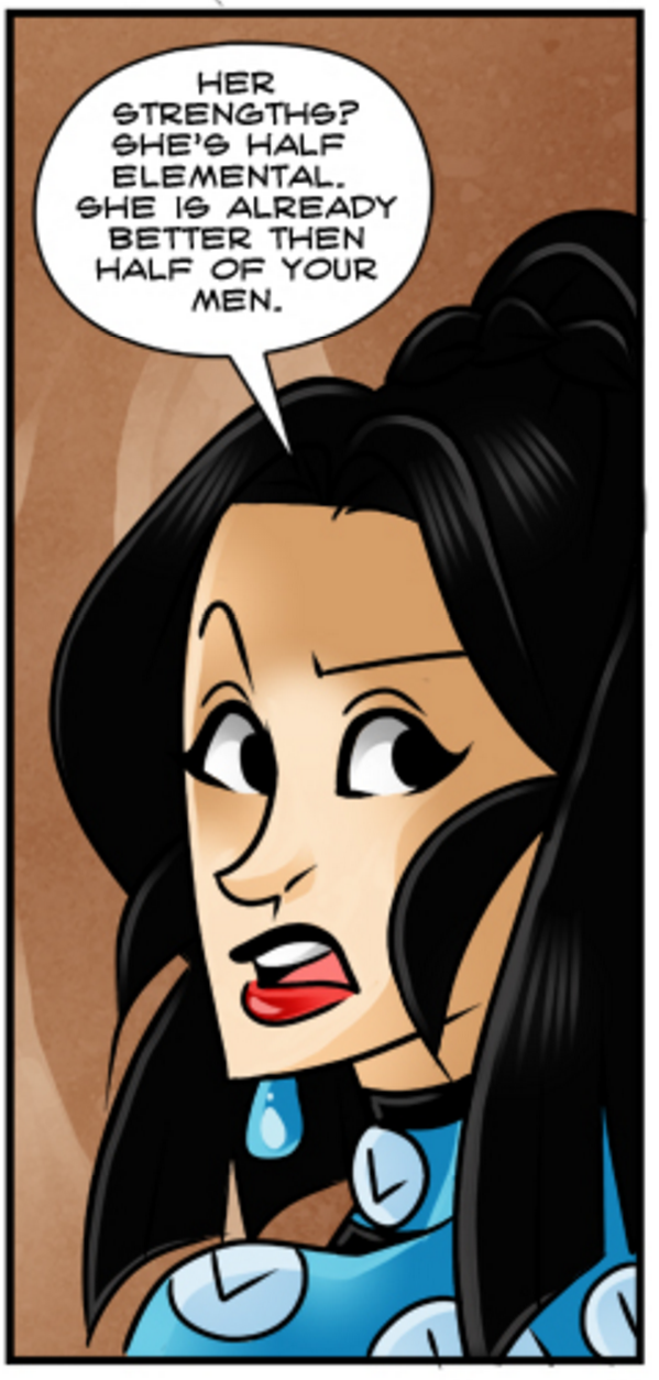
Along with the gorgeous artwork and the use of colour, comes the ability to create great character designs. The Perry’s demonstrate this creativity by tying the story world and history in with the way the characters are designed. The characters have unique traits that are represented physically, and are hinted at with the use of colours in their outfits.

I’d probably scream too if I saw a naked water-woman.

Moving away from colours, there are a few proportional errors that appear most often in the earlier chapters that could be addressed. However, those errors are relatively nonexistent in the later chapters.

“My, what a big head you have…”

In fact, the art has made some great improvements from page one to where it is currently. The Perry’s also continued to make their art fresh and exciting by changing up the characters’ outfits every now and then.


“On the stroke of twelve, the spell will be broken, and everything will be as it was before.” …or will it?

Conclusion

To conclude, I think that Out of my Element by Alli and Jim Perry is a fantastic story that is perfect for any reader. It has a great plot and some amazing character designs. I would recommend checking this comic out!


You can read Out of My Element, here.

Shades of Men by Jrej


Shades of Men follows the story of Lev and Ricky, two long-time hobos living in Paris. As they meet a young boy thrown out on the streets, they decide to help him no matter what. 

But the quest for survival and redemption won’t be easy and ghosts of the past will stand on their way.

Story

Shades of Men by Jrej is a hidden gem on Tapastic with just over 100 subscribers. I think the reason for this may be that the comic isn’t given much of a chance as the artwork isn’t on par with popular comics. But the story? The story is incredible.

The comic appears blurry in the first few chapters.

Shades of Men takes place in the underbelly of Paris, France. He shows us the disparity between how the world views Paris, with tourists influencing the treatment of the poor and homeless, and the reality of trying to find a job in a city that stigmatizes you.

There are great character development opportunities throughout the comic. Jrej makes sure that the characters have enough intrigue to really push the reader to keep reading and figure out exactly who they are and how they ended up as mere “shadows of men.”


Reading just the first chapter, you may not think too much of the story. Although Shades of Men does have a good introduction, alone, it isn’t enough to keep people reading. There is a clear plot, there is a new character introduced even at the end of the chapter to intrigue people in chapter two, but it wasn’t until more of their world was introduced, and a fabulous plot twist was brought in, that I really got dragged into the story (end of chapter 3). Three chapters may feel like a lot, but it’s an easy read and the first two chapters are important for buildup.

Writing

As for the writing, well, we already know that the plot is there and in order for that to be the case, the writing has to be up to par. Jrej does an excellent job with grammar and spelling. There may be a few areas where it could be improved, but based off of the population that Shades of Men focuses on, grammar errors could very well be on purpose.

The real issue I have with the writing is that it can feel scripted at times (especially in the first few chapters). However, Shades of Men has some great flow once a conversation gets going. The awkward parts pop up again whenever a new character is introduced to help with plot transitions. These need to be worked on.

Overall, I think the writing isn’t half bad. There are certainly areas of improvement, but those become evident in the later chapters. Jrej is continually growing as a storyteller and an artist as the plot moves on.

Art

Although the artwork in the first few chapters isn’t quite what people may be looking for, it still is clear enough to impact the way the story is told. The farther you read along, the better the artwork gets as well. So give Shades of Men a chance if the art is the only thing that is really pulling you away from this story.

The pages become clearer in the later chapters.

One of the problems with the art is the stiff design. The characters feel very two dimensional at times, as if they are posing. There is also a lack of eye contact between characters which can also make the conversations feel awkward and scripted.

Not only does the image look flat, but the angle and point of view is awkward.

However, Jrej makes up for this by bringing in unique panel designs that really help express the scenes and the story overall.

Adding a broken panel border, Jrej has really emphasized the violence of the scene.

The panels influence the way the scenes are depicted, but they can easily be overlooked if the rest of the artwork isn’t complimentary. By working on sharper line work and proportional accuracy, Jrej could drastically improve this area.

The same goes for distancing. There are a few great moments captured in some scenes but they are weakened by some artistic errors. Working on perspective could really improve these scenes as well.

The food that came off of his spoon must of been massive to be that big when it hits the guy.

Jrej has very clear strengths and weaknesses when it comes to his art. Paneling is definitely a strength, proportion and perspective are weaknesses. Another strength is his ability to create flow within a panel or page. The eye smoothly moves from one corner of the page to the next, following the direction Jrej takes you.

Nice sequence from top to bottom.

Lastly, the backgrounds. Shades of Men offers some great historical scenery throughout the comic. If you have ever been to Paris, or know anything about it, than you may recognize several places depicted here. Again, as the comic progresses, Jrej improves in his backgrounds and does an excellent job with one-panel pages.

Conclusion

Shades of Men by Jrej is a diamond in the rough. All it takes is a bit of shining to see that this comic has a lot of potential to be something truly great.

I would challenge any reader to give Shades of Men a read-through. Read it all in one go, pay attention to the details, and make a decision on whether you think it is worth it. I say it is.


For new readers, check out the chapter version of Shades of Men here.

For readers who want to have one page at a time (more frequent updates) read it here

Thaeria by Alcruid


It’s the Era of Dragons, 1264
The Pandragoran Empire rules the biggest part of the world when all living and moving creatures in the capital, far in the east, die, including the emperor. A few days later, dragons are extinct.
The people only know to blame the bloodwitch, and quickly avenge their emperor…

but the world changes

644 years later on the other side of the world, The fate of five young people intertwine in Elledorne. 
A young boy from an infamous family, a former warrior slave who tries to do good, a wandering halfnymph, a mage who sees more than he’d want and a halfelf with a hidden past.
As they meet they slowly start to discover the secrets of the massacre in Pandragora and what other mysteries might hide in this vast world named Thaeria…

Story

Thaeria by Alcruid has an impressive prologue to the story. Alcruid manipulates the contemporary format and creates a long scrolling prologue that flows smoothly with narrative and blending images.

The character that is introduced during this time is very intriguing and pulls you right into the story. However, that character is removed when the actual story begins, introducing us to a new main character.

It is a pretty sound way to get the readers interested in the story, and I’d say that Alcruid does it fairly well. The letdown comes with the poor introduction of new characters after that. As the story currently stands, almost every character that appears in the plot has not had a proper introduction or has lacked background information for us to really know why they are there. It takes a bit of guessing to piece it together.

Introduce this character in the background of the scenes beforehand. Have him ease-dropping and then sneak out of the café before returning with the other character.

The confusing introductions lead to a confusing plot. Although it remains muddled in the beginning few pages, the plot eventually does clear up and Thaeria offers some interesting plot twists to bat.

The real issue here is that there isn’t that much of the story released yet, and Alcruid is currently taking an indefinite hiatus.

Writing

As for the writing, it comes across awkward and scripted. There is a lot of talk and too little show. This story would benefit from breaking down the script and seeing how much of it can be shown instead of spoken.

That’s a lot of white space for that much talk.

Another area where there could be some improvements is (you probably already know where I’m going with this…) grammar and spelling. I don’t think I need to explain this one too much. Just make sure you proofread your work before releasing it, and double check by getting someone else to read it as well.

There are great opportunities for some serious plot buildup in this story that seem to have been overlooked. Don’t rush the story, take the time to meticulously think out all the details and determine what is important and what isn’t for the readers to know at this point. This ties in with character introductions and how the information is told to us. Also, cut out the fluff that doesn’t add anything to the story.

Cute, but what does this have to do with anything?

Art

As for the art, Thaeria has gorgeous colouring with deep, bold colours that are contoured by shadows. This is especially evident in the prologue.

Stunning!

Although the colouring is fantastic, there are a few areas that need improvement in the art department. There are several proportion and angling errors that I’m going to bunch together since they usually occur together. Get out those straight lines and find your vanishing points. Study the anatomy of the human body to see how long an arm should be, what a head should look like from different angles, etc.

Stiff and awkward

I’d love to compliment the backgrounds in Thaeria, but there really aren’t that many. This ties in with the large amount of white spaces mentioned earlier in the writing section. That being said, the images that Alcruid does show us are absolutely beautiful.

Conclusion

I think that Thaeria by Alcruid does have some great plot twists to offer, evident of a thought-out plot, but there is definitely some scripting that needs to be looked into. The art shows great potential that can only improve with practice.

As the story is currently not very long and it is on an indefinite hiatus, I can’t recommend this as a read. Keep an eye on it, though. You never know when an artist may come back to a project.


You can read Thearia by Alcruid here.

Blog at WordPress.com.

Up ↑